Websites for translators or other professionals
Quick and easy websites!
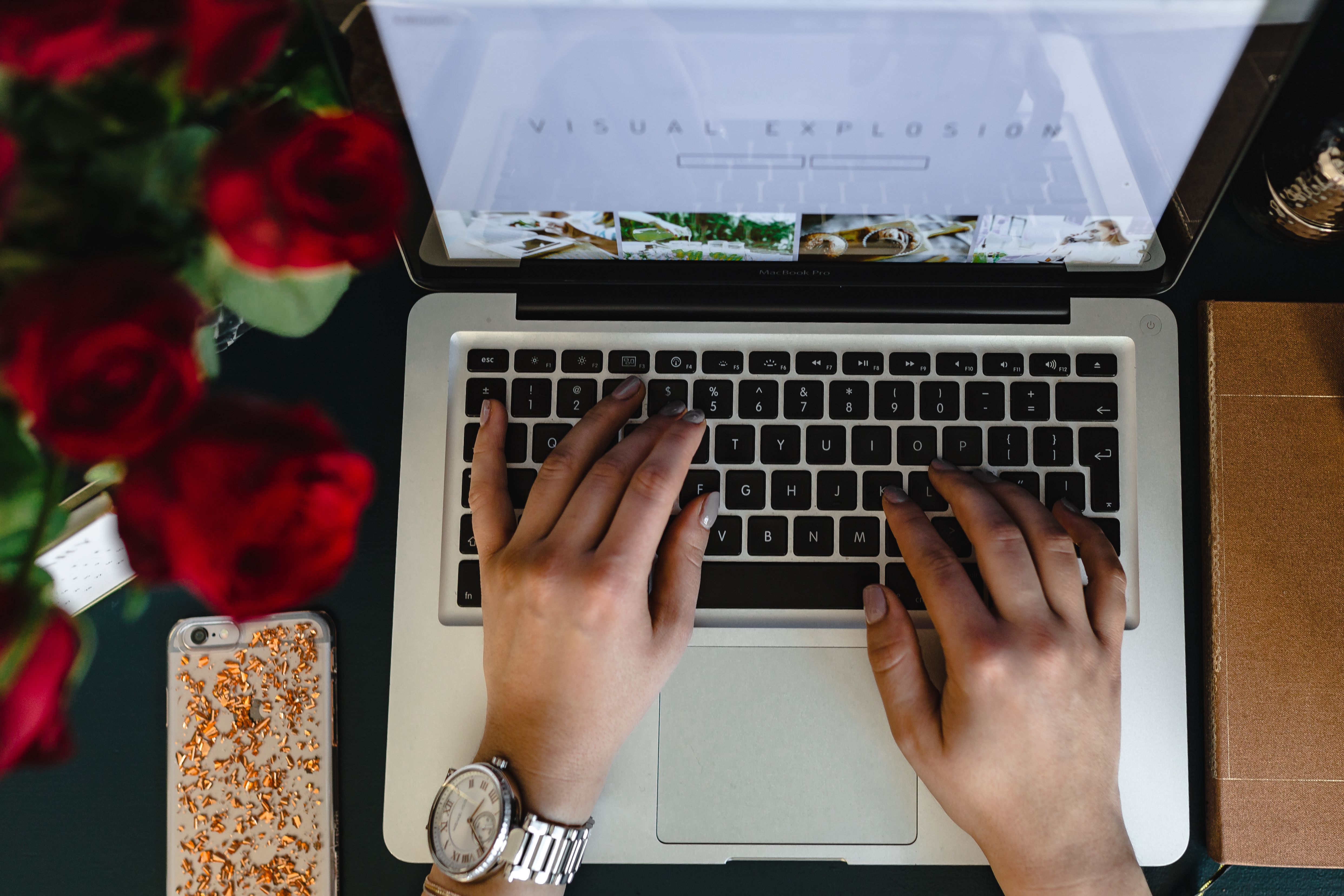
I’ve wanted my own website for a long time. A place where I could showcase my abilities and let potential clients know who I am and how I can help them. Where people would enjoy visiting and checking out my new content. And for many years, that idea is about as far as I got.
I did start a few times – set up a WordPress profile, downloaded some templates, even ordered web hosting. But I never followed through with it. Either I got buried in work and had no time to work on the website, or I got tripped up on some issue I didn’t have the skills to handle. Because the truth is that building a website with a few clicks can’t be done. Well, technically it can, but only if you’ve put in many hours of work first.
Last summer I had several major translation projects come to an end practically overnight. Together, they kept me busy and made up the bulk of my income. Now all of a sudden I had plenty of free time, and thoughts of the future filled me with apprehension. I quickly realized I could hardly expect a better opportunity to build my website and improve my business to come along, so I resolved to seize it. First I looked for a web designer to design my website as I envisioned it, but nothing I found seemed quite right. What I really wanted was to learn to do it myself. These days you don’t have to know how to code in order to build a website, since there are plenty of tools and applications out there that can make things easier. You just have to start. I signed up for a course run by my colleague Tanya Quintieri, called “Build your website in 30 days using WordPress*”. I was pretty sure 30 days wouldn’t be enough, but I thought if I played my cards right I might pull it off in 60 days. So I went for it.
Quick and easy?
Even though I had some training and a rough idea of what building a website would entail, I found the course a bit of an eye-opener as to what all I would have to consider, write and arrange. You have to learn and understand, at least if you want to do it right and get an end result that works. The goal is a website that looks good, is easy to navigate and does what you want it to do: draw in potential clients, inform, sell, entertain… (fill in as needed).
Roughly speaking, the issues for consideration fall into the following categories:
- the technical details: what tools to use – platform, software
- structure and content: how to structure the website and what to put on it – how to organize pages, menu, website footer, web copy, images, logo, etc.
- users: how to build your website so users can navigate it easily and find what they’re looking for – or what you want them to see
- operation: how you plan to manage and operate your website: how the website will work, hosting, editing, adding content, etc.
- SEO – how to make sure people can find you online
- social media – how to make your website visible on social media
Millions of words have been written and millions of videos recorded about each of these aspects, and I certainly don’t feel the need to add my thoughts to the mountain of information available. So I’ll restrict myself to what each of these areas meant for me personally, what I had to learn and where I had the greatest difficulty.
Technical details
There was no question in my mind on this point. WordPress is one of the most popular content management systems in the world, and I had already dabbled in it during my previous attempts. I knew it had tons of templates you can fill with your own content, so you don’t have to learn to code or even understand it particularly well. But what had always irritated me was that even though the template I chose looked great in the sample, I was never able to make it look as good. I didn’t understand the differences between the different templates, and I always seemed to end up with sub-par results.
On Tanya’s course I learned about a template called Divi, which you can actually edit not just on the back end (in the website admin section), but on the front end, in the browser window where you can see what everything looks like and every change you make shows up right away.
First I had to register the domain name marketademlova.com, of course, and sign up with a web hosting service for my website. This is not a complicated process; it just takes a few clicks (no, really) and the package includes your own email address. I got the template included in the price of the course, but you can also buy a one-year license for just under €90 or lifetime access for €249.
Then I had to tackle installing the basic settings and choosing the plugins to give the template the functions you want, such as connecting to social media, security, backup, or multiple language versions. It took me a little while to figure out how to work with the template, but fortunately there are plenty of guides and videos online explaining everything in exhaustive detail. Basically you split every page into sections and sequences, and then you put the modules into each one, like hanging things on a bulletin board. Text, images, videos, buttons linking to other pages, your contact form and anything else you typically see on websites. It takes a bit of patience, but when you get into the flow of things, it’s like playing with a construction set. You might even catch yourself having fun. Divi includes access to a library with dozens of designs for different types of sites: a professional web designer site, a food blog, a travel blog, a wedding site, etc. You can use these as is and just put in your own content (although in that case the style and layout is set for you), or you can pick and choose the parts you like and put them into your own site. I used these designs to look at the structure of the different components in the admin section and figure out how they were made. The perfect study material.
Once you’ve got the technical aspects more or less in hand, you can start playing around with different layouts, color schemes, fonts, backgrounds for text or images, animations… The possibilities really are endless. You can let your imagination and creativity run wild, although if you’re relatively inexperienced like me, you might want to keep to a single style and not go overboard with the special effects. For one thing, they slow down page loading and performance, and for another, they might end up being distracting and making your site look cluttered.
Divi is fully responsive, which means that it automatically adapts to the size of your device, so your site will look great on mobile devices as well as computer screens. The web editor lets you see how your site will look on a mobile phone or tablet, so you can adjust the font size or line height as needed.
To be continued…
* Tanya is offering a 10% discount on the course (just under €90 total) for anyone reading this blog post. Just enter STAR2018 to apply the discount.
Do you like the article? My newsletter will let you know when a new post appears.
Subscribe for something to read with your morning coffee once a month!
Leave A Comment